Have you ever needed to track down a bug in mobile, but due to circumstances found yourself without the needed browser, operating system, and/or device? It can be really frustrating, especially when working with an ever approaching deadline. Thankfully, there are many tools available to help debug in such a situation, even if using them isn’t a proper substitute for the actual device.
Please Note: The following tools are not a proper substitute for actual devices.
iOS Simulator
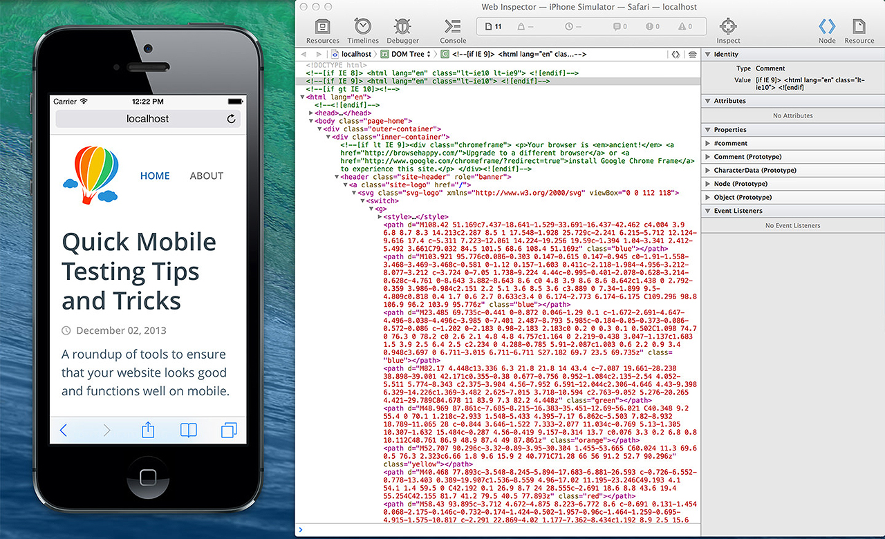
For debugging on iOS, check out the iOS Simulator, which comes packaged within Xcode. The simulator has different versions of both the iPhone and iPad, which can easily be rotated and scaled, to test in portrait and landscape orientations and fit onto your monitor, respectively.

To open, go to Applications > Xcode (right click and “Show Package Contents”) > Contents > Applications > iPhone Simulator. Once the program is opened, you can easily add it to your the Dock.
Integration with Safari Web Inspector
The iOS Simulator also has integration with the Safari Web Inspector, which can be accessed from Develop > iPhone (or iPad) Simulator.
More Info: Here’s a great guide to Using Web Inspector to Debug Mobile Safari by @jimniels.
Opera Mobile Emulator
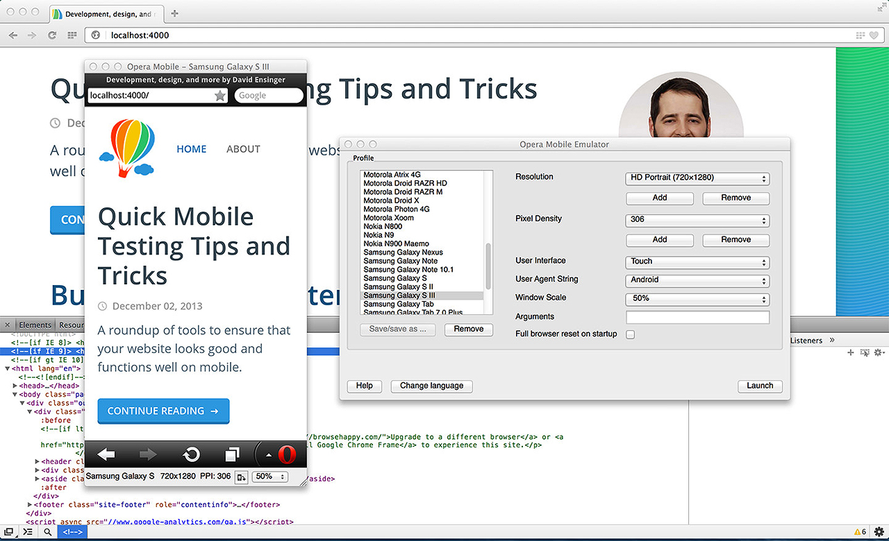
Opera supports mobile debugging via their Opera Mobile Emulator, which comes ready with more than a dozen presets to mimic the “defined resolution, pixel density, user interface” of popular devices. It can be paired with Opera Dragonfly, a suite of developer tools.

Firefox
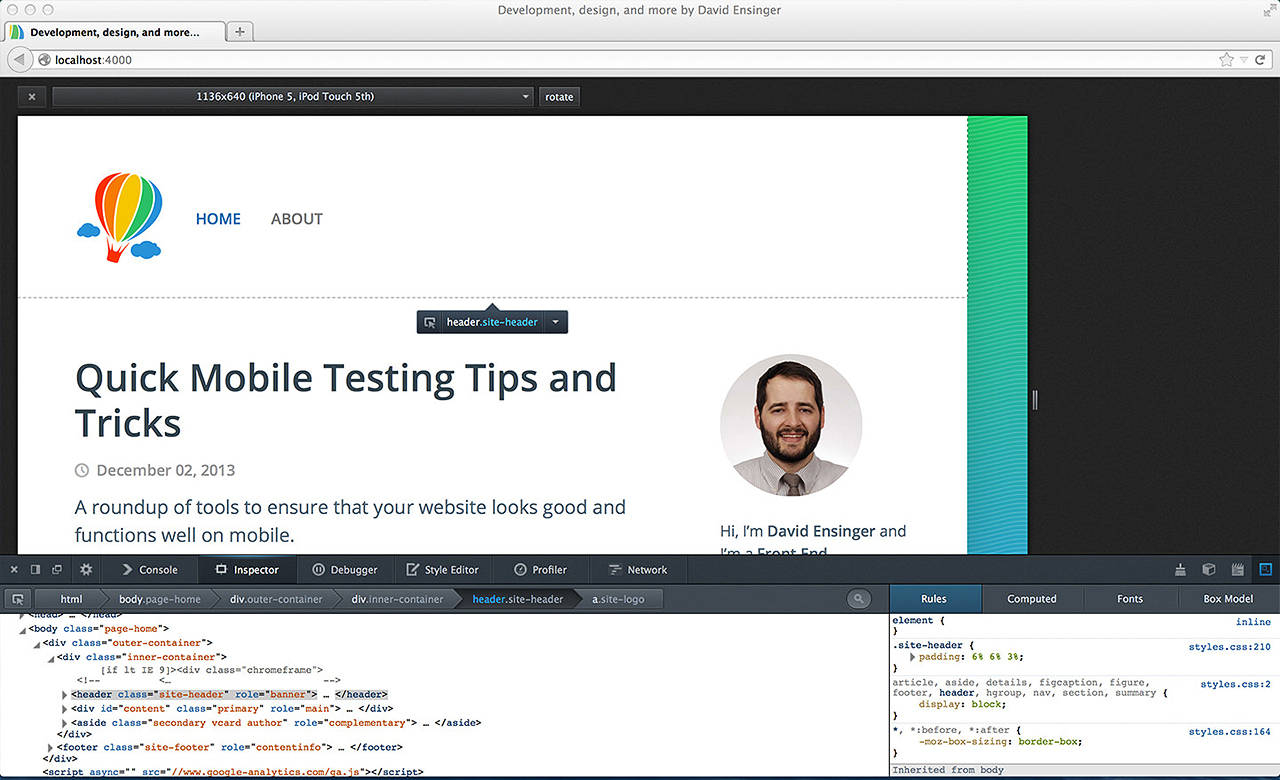
The Firefox Developer Tools have come a long way in the past year. Amongst the many recent additions is the Responsive Design View, a tool to easily switch between viewport widths and device orientations. For additional resolutions, see More Display Resolutions.

Extensions for Firefox
These extensions may be helpful as well:
- More Display Resolutions: Adds additional resolutions to the Responsive Design View
- User Agent Switcher: Adds a menu and toolbar button to switch the browser’s user-agent string.
Chrome
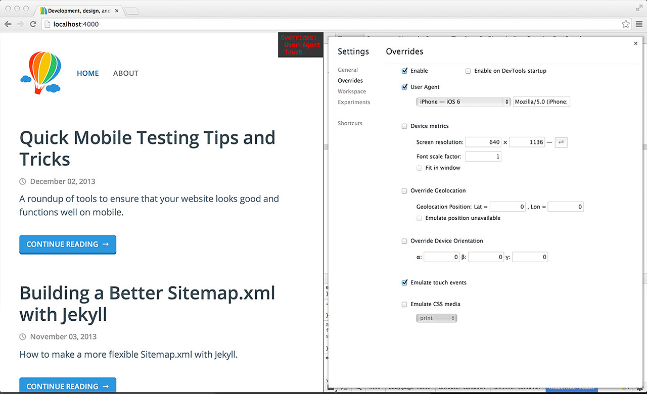
The Chrome Developer Tools come with a several features that are helpful when emulating mobile:
- Emulate touch events (usally not present on traditional desktop devices, although this is changing)
- Emulate device viewports
- Network bandwidth throttling (simulate a slow connection)
- Device orientation overrides, amongst others

Extensions for Chrome
These extensions may be helpful as well:
- Resolution Test: Views for different screen resolutions, with an option to define your own resolutions
- Responsive Inspector: Inspects media queries
- User-Agent Switcher for Chrome: Spoofs and mimics user-agent strings.
That’s it. May your mobile debugging be better, especially when ill-equipped and under pressure!